The primacy of colors by ARD Raccanello
How many times do we let ourselves be guided by color? At the traffic lights as in the supermarket, in the voting booth as in the bookstore and almost everywhere. Our relationship with colors has evolved over the centuries and, with the advent of digital, it has become stronger. Trends tell us how we should dress, what color to paint the bedroom, which salt we should use and how many shades gray has.
1001 ways of being ARD Raccanello
In a world where everyone prides themselves on being trendsetters, ARD Raccanello claims to be a historic paint factory, which has made paints its flagship over the years.
Since 1949 it has witnessed the evolution of color, making it concrete and closer to those who use it. With the 1001 colors palette, it wanted to pay homage to the interior furnishings, creating 4 harmonic shades, divided into sections:
– whites (variations to pure white)
– pastels (very linked to the Italian tradition)
– neutral (inspired by balance and elegance)
– colored (a wide range of colors)
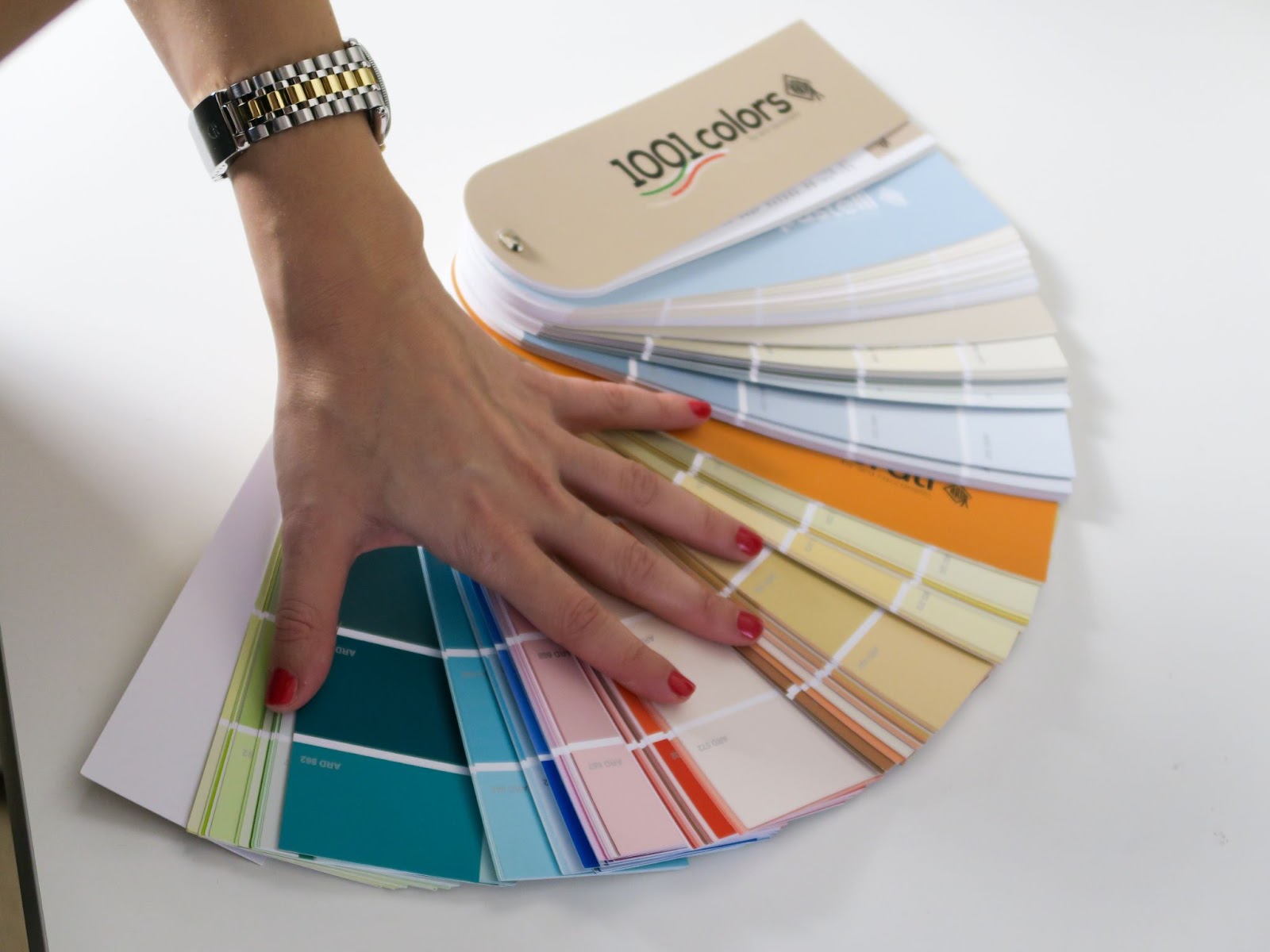
Thanks to its tinting system, ARD Raccanello has developed a creative formula that gives light wide chromatic possibilities. For those wondering what tintometer is, just know that it is a device that allows you to arrive at a new shade starting from different colors, managing the process in a smart way with software that helps in the choice of combinations.
If commercial spaces are to attract the attention of customers and somehow retain their perceptual memory, our homes must instead welcome us and make us feel good. The paint products used for the interiors have a very strong link with light, both natural and artificial. The perception of colors depends on the lighting, because the light condition is able to greatly influence the perceived shades. We think of an environment with blue walls kissed by the sun that enters through a shutter and the same environment when a storm rages outside.
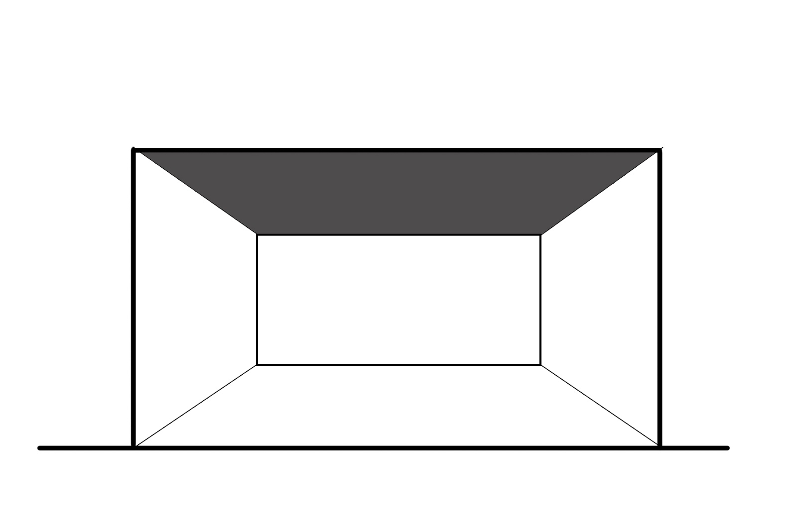
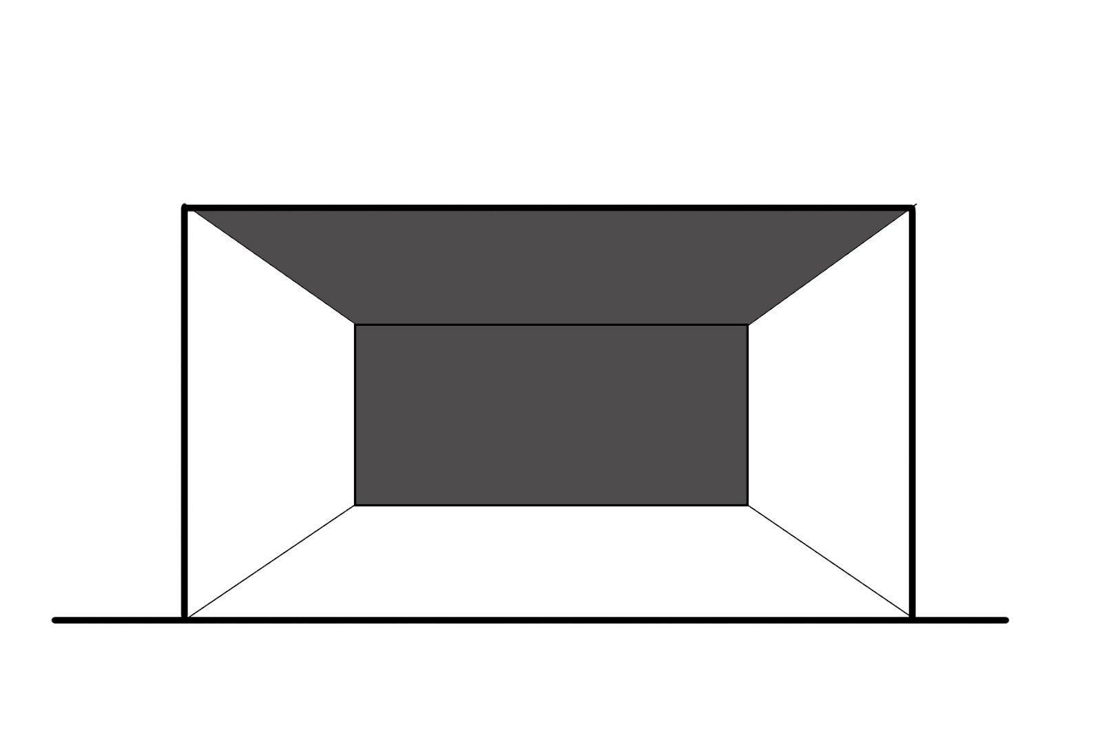
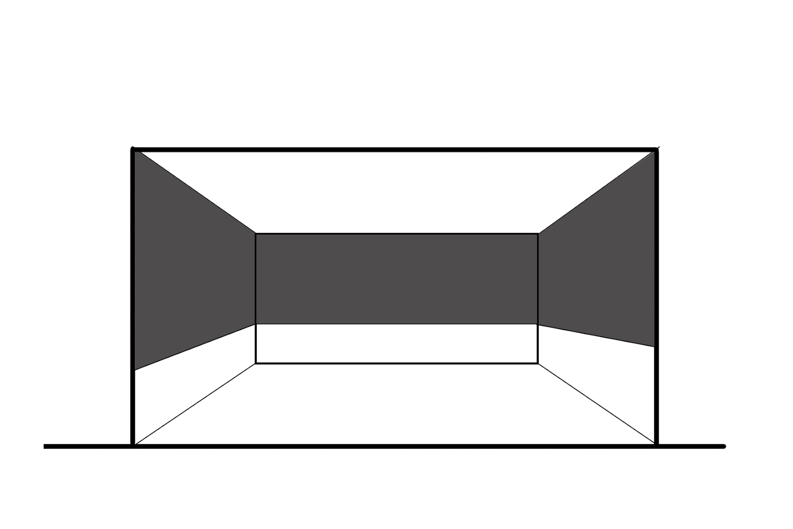
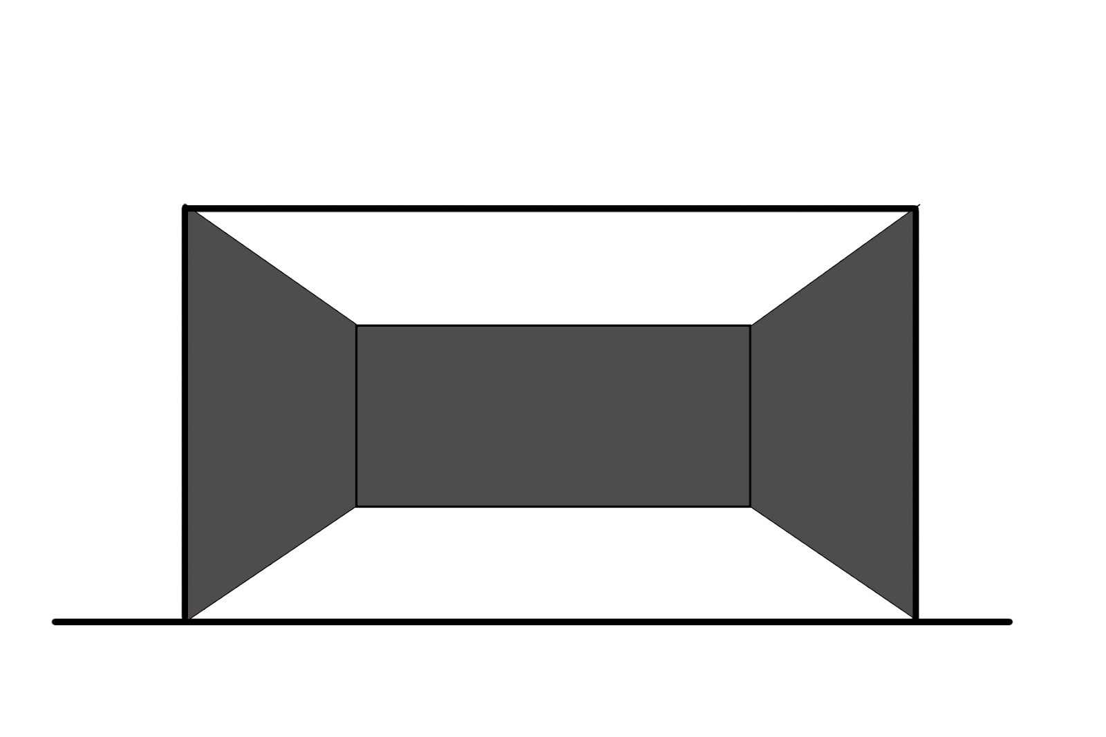
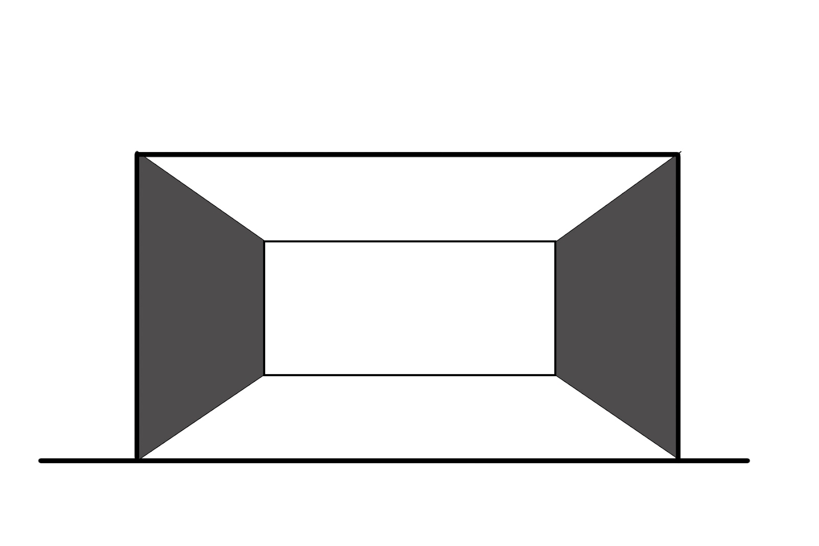
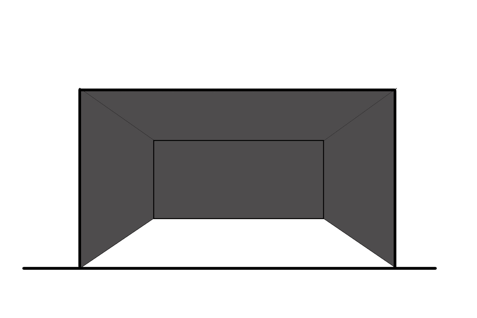
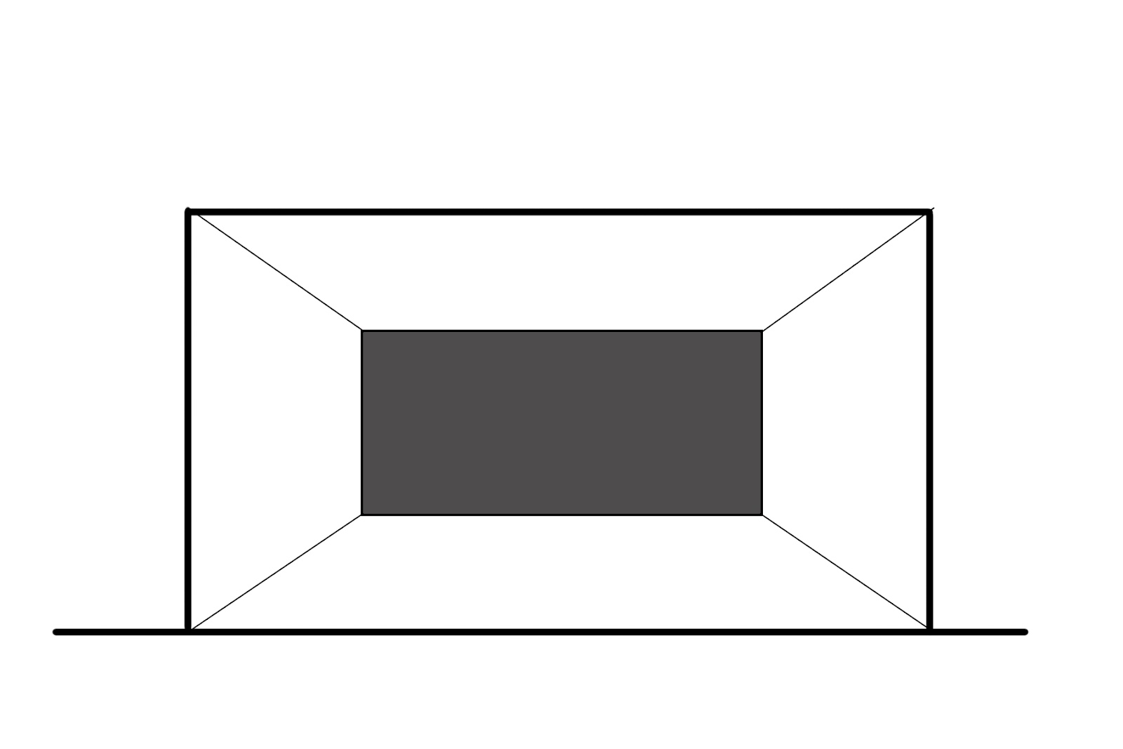
How the color of the walls changes the perception of space
A small but well-lit environment appears larger than it actually is, as long as the color and its location are well studied. Helping me with some simple sketches, I show you how color can change the perception of space:
Bright colors or soft colors?
Those who choose brightly colored paintings often make a reference to the past, to those bold interiors that brought home a political and cultural revolution that traveled in factories as well as in squares. It was the 1960s and there was a certain chromatic euphoria. Today, however, the design tends to suggest a wide use of sober colors and neutral or pastel shades. Contrasts often rely on furnishings and even more on accessories. But it’s a matter of taste, often guided by real needs. What is certain is that color still has its own primacy, inside as well as outside. Before the shape, we always pay attention to the color.
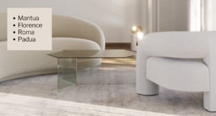
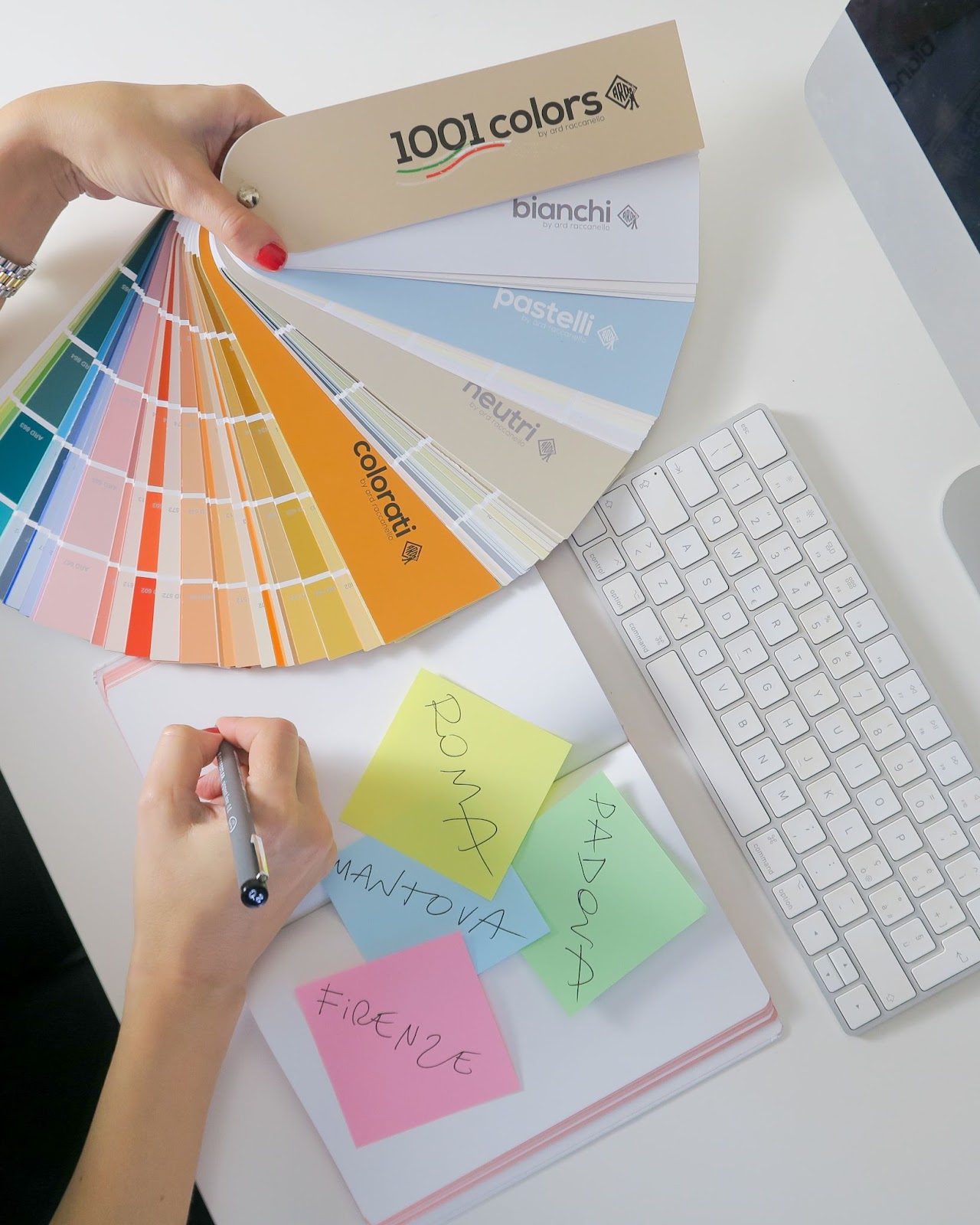
The primacy of color: 4 cities for ARD Raccanello
What do Padua, Mantua, Florence and Rome have in common? The answer to this question is the concept of a color project that I am developing with ARD Raccanello. It will be an interior project, set in several cities, with a very specific peculiarity. Color will guide me, with the 1001 colors palette.
Article in collaboration with ARD Raccanello