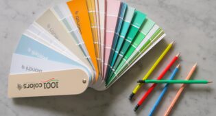

Color has the ability to change our perception of spaces, a topic that we have already addressed with ARD Raccanello in a previous article. The graphic and visual demonstration of this concept is expressed in this chromatic project created for ARD Raccanello. I took care of the design composition of the space, ARD Raccanello gave me its 1001 colors palette.

The color palette is divided into 4 categories (white, neutral, pastel and colored), with all the colors identified and developed by the Italian company. The concept I wanted to give to the color project is inspired by 4 records from 4 Italian cities. These are projects or places that have a primacy of longevity in different fields. The 4 selected cities are Mantua, Florence, Rome and Padua. I thought of creating a unique interior, which changes chromatically depending on the city it is associated with. In this way, the eye has the same foothold in terms of shapes and elements of furniture chosen, but a chromatic effect and therefore the creation of a totally different atmosphere and stylistic approach to the space.
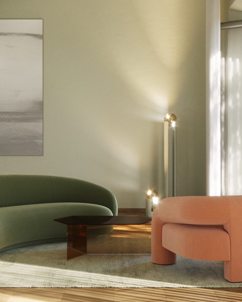
Palette Bianchi with the primacy of Mantua
In Mantua in 1664 it was founded what is considered the oldest newspaper in the world among those still in publication. The white pages of the Gazzetta di Mantova have been informing readers for centuries and have inspired this living room with the Bianchi palette (whites). It’s a glimpse of furnishings with soft and welcoming shapes. The selected nuances always approach some shades of white, deviating slightly to turn beige, greige and ivory. With a palette of this kind, a bright and contemporary environment is created, which stands up well to the passage of time and fashions and which hardly creates a visual overload that tires the eyes.
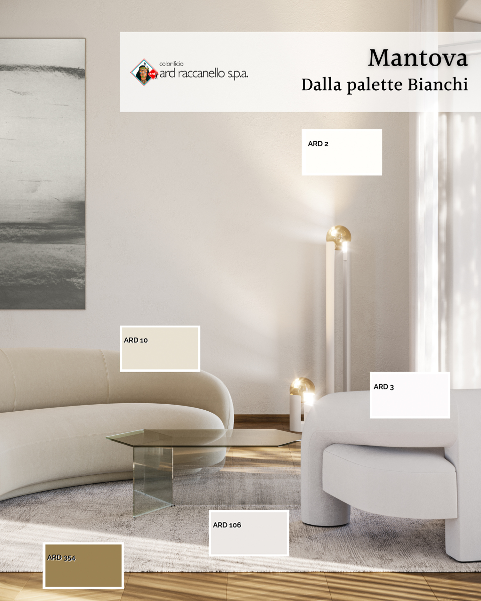
Colors:
ARD 2
ARD 10
ARD 3
ARD 106
ARD 354

Pastelli palette with the primacy of Florence
Florence is home to the oldest pharmacy in the world, a real architectural jewel within the convent of the Basilica of Santa Maria Novella. The Officina Profumo-Farmaceutica di Santa Maria Novella, this is the original full name, was founded by the Dominican friars and has been open to the public since 1546. Starting from the lilac colors of its ceilings, I created an aesthetic mood with the Pastelli palette (pastels). The shades of pink meet those of beige in a delicate mix of cozy, warm, suspended and reassuring atmospheres. Here the space seems to focus on things, bringing them closer together, perfect for satisfying sensual appetites.

Colors:
ARD 667
ARD 41
ARD 687
ARD 129
ARD 368

Palette Neutri with the primacy of Rome
Rome and its eternal beauty are the house of the Musei Capitolini, a place where art has lived since 1471, the year in which Pope Sisto IV gave the Roman people a group of bronze statues. From 1734 they opened their doors to the public as a space where art began to be usable by all. With the Neutri palette (neutrals) you can easily have success in terms of pleasant and comfortable sensations. The living room seems to whisper “eternally now”, as if to suggest a space in which there is only a time that is current, never past. Those who fear neutral colors perhaps fear a taste that is embraced by a large majority, which reflects the personality of many and which over time has an excellent ally.
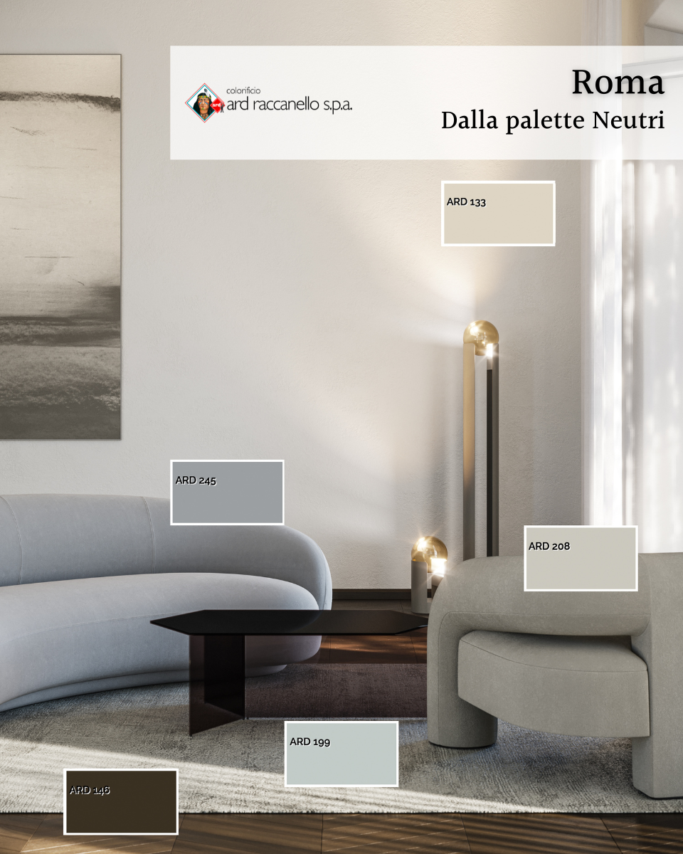
Colors:
ARD 133
ARD 245
ARD 208
ARD 199
ARD 146

Colored Palette with the primacy of Padua
The botanical garden was founded in Padua in 1545, today considered the oldest in the world still in its original location. Since 1997 it has also been recognized as a UNESCO World Heritage Site. The living room inspired by the botanical garden of Padua has autumn vibes, obtained with the selection of the Colorati palette (colored). These bold but not strong shades are a great way to bring color into our spaces without it being excessive. The sensation they transmit most is linked to the charm of warmth.
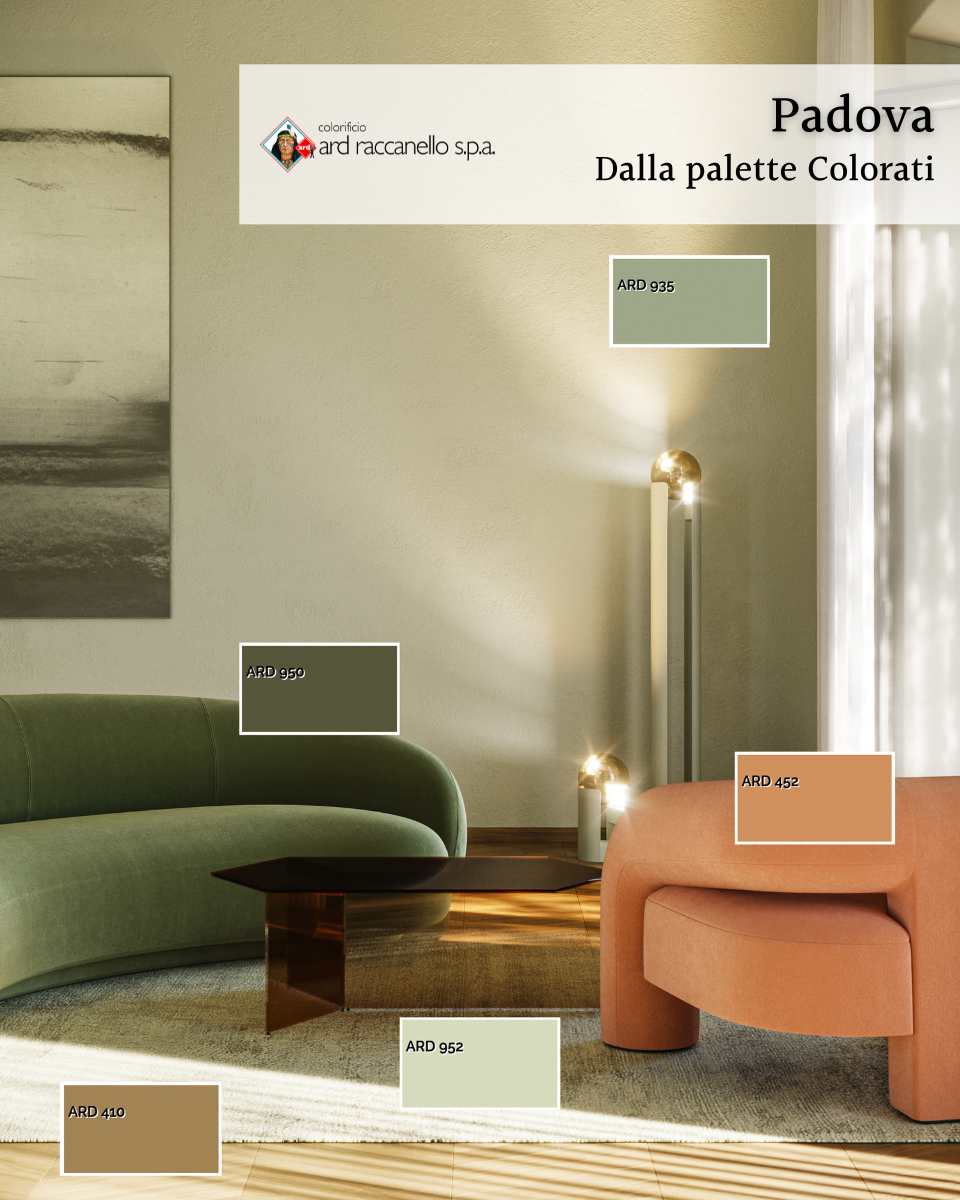
Colors:
ARD 935
ARD 960
ARD 452
ARD 952
ARD 410
ARD Raccanello palettes and its know-how
Between project and realization there should be no necklines or different aesthetic results. Yet it can happen, especially when managing the colors to be applied to different surfaces. Relying on a company with dedicated assistance that puts its know-how at the customer’s service, means relying on skills and experience. ARD Raccanello has a free service dedicated to customers throughout the purchase cycle (pre and post-sales). Its know-how emerges with technical and managerial skills, aimed at the preventive resolution of possible problems. The goal is the perfect conformity of the colors seen in the design phase (perhaps on a render or through the color palette) and their aesthetic appearance once the project is finished.
Article in collaboration with ARD Raccanello

3 Comments
really interesting all these subtleties.
how to define a feeling
not easy !
This vlog is well executed, where art meets design and innovation where there is an obvious synthesis of ideas, material, and style that is inherently elegant.
Best comment ever, thank you so so much!