
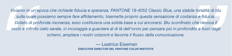
The year has just begun and we enter into a new decade chromatically under the banner Classic Blue 19-4052. The Pantone of the year is a timeless classic that combines design and art and – as we see it – it’s applicable to many contexts.
According to Pantone, the Blue 19-4052 is capable of instilling calm, trust and a sense of connection “highlighting our desire for a stable and reliable base from which to start as we prepare to cross the threshold into a new era”.
Here we are – starting the year with a timeless, simple and elegant nuance, which in the near future we will see more and more around us, because always more often Blue 19-4052 will pass from the colour pallets of us designers into the reality of being used for furnishings and finishes.
In fact, although maybe I was expecting something more “enterprising” from Pantone as the colour of the year, I find the Classic Blue to be a deep, quiet, imperturbabile colour that recalls the world of art naturally and with ease. How can we forget Yves Klein’s devotion to blue and also Wassily Kandinsky’s theory of colours, where blue was described by the artist as a deep colour with centripetal force, so much so that the great Russian artist compared it to the sound of a cello or a double bass.
Another positive feature of Classic Blue, unlike other more vibrant shades, is surely that deep shades of blue are among those that we tend to tire of less. Remember, colours which are particularly strong or unusual, can over time become very tiring, especially when used in quantity.
And so, how to use Classic blue in the best ways? Here are some tips.
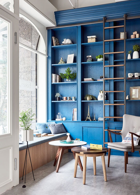
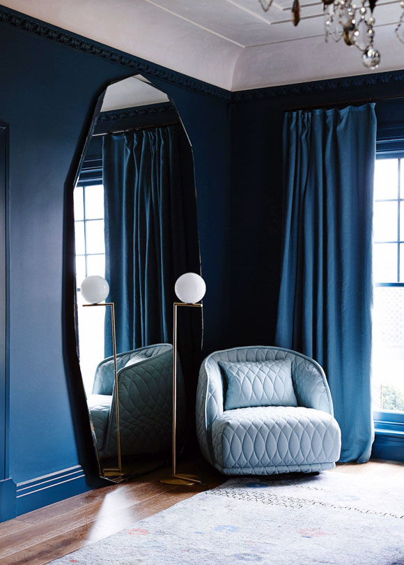
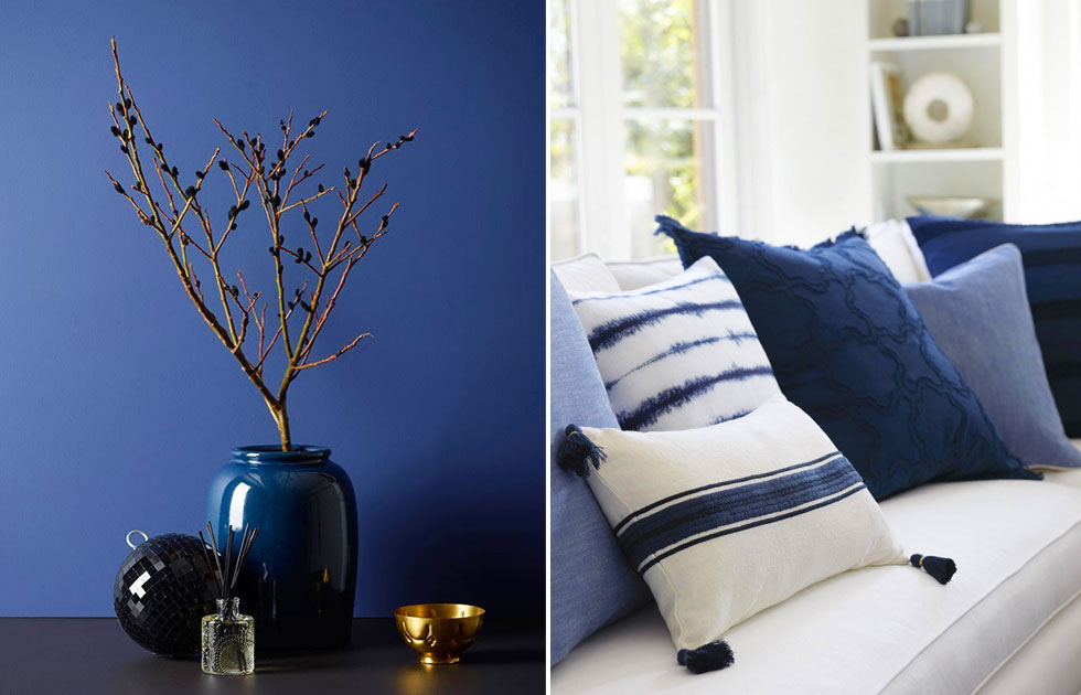
The walls, but only a few.
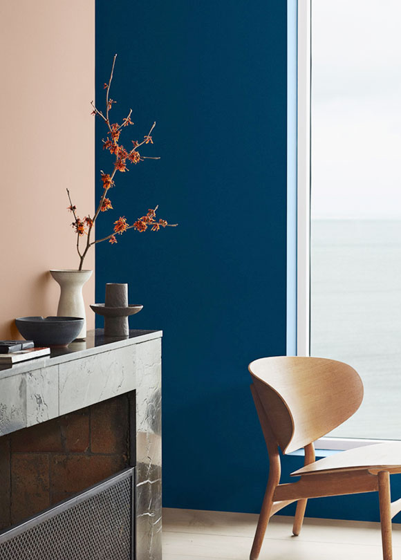
Painting some walls in the home a different tone to the other walls has always been a must. As I have already said, Classic Blue is already a classic shade, which we don’t tire from easily. So, let’s allow this colour to enter into the dining room, the living areas, the bedroom or the bathroom. Basically, wherever you prefer. Remember however, that being a saturated and very full shade, it needs to be placed in well lit areas so as to appreciate its value and not become too dark.
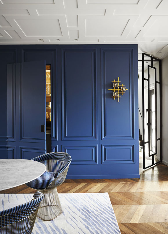
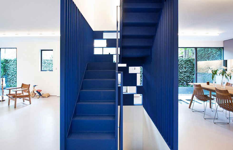
In addition to the walls, how about applying it to a structural element, such as the stairs?
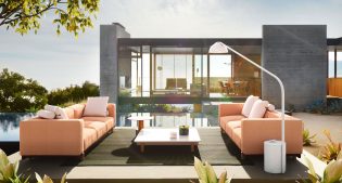
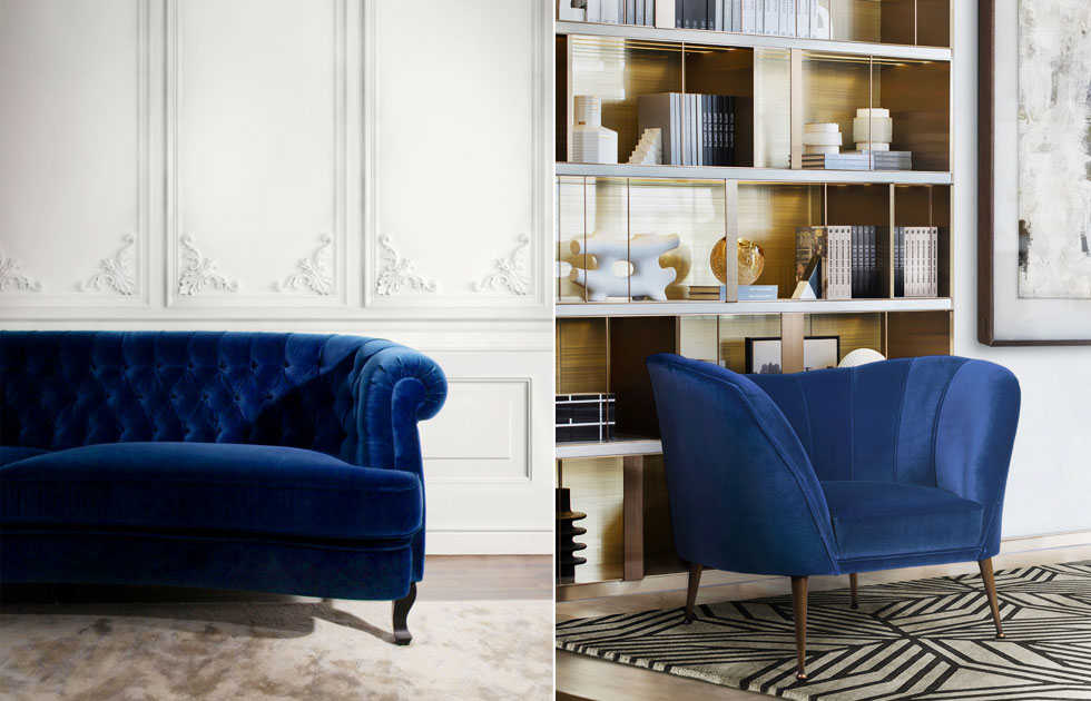
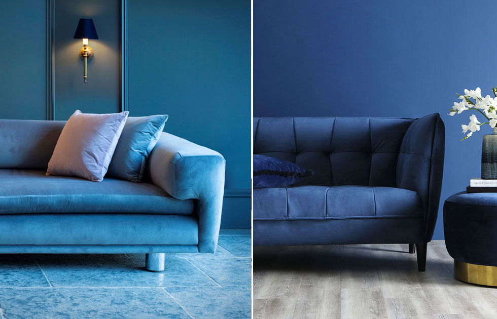
Upholstered furniture: armchairs and sofas.
With this type of thing you can never get it wrong, even when you choose blue. Yes, because blue in the world of upholstery is a colour we can use without worrying, as it is very popular. If you would like to use this shade to characterise your living area or your relaxation corner, I advise you to keep an eye on your favourite store or brand: I have no doubt that they will soon be offering us limited edition versions of some of their flagship products in Classic Blue.
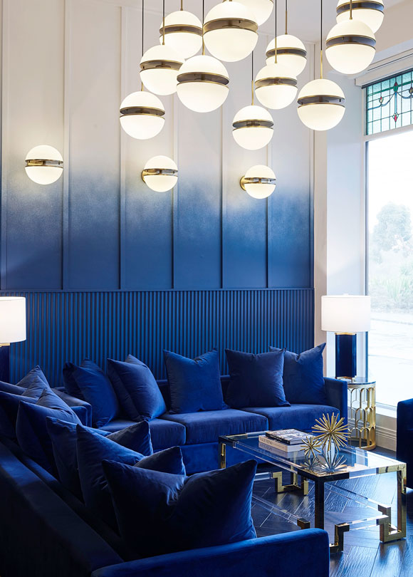
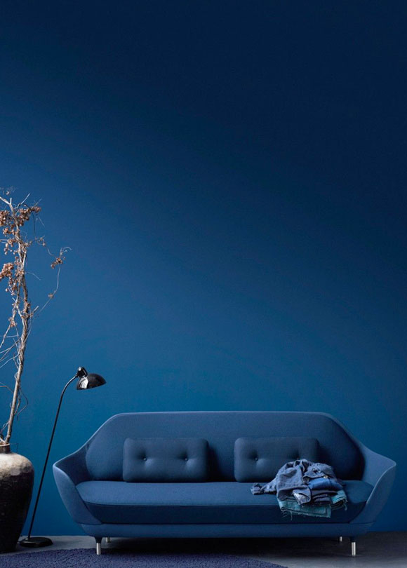
The biggest trend: walls and sofas, tone on tone.
If you have fallen in love with the colour of the year, you could be daring and use it in quantity on the walls and in the upholstery. If you are feeling very confident include the colour in the flooring as well. The result would seem to be a visual immersion in a sort of… domestic sea!
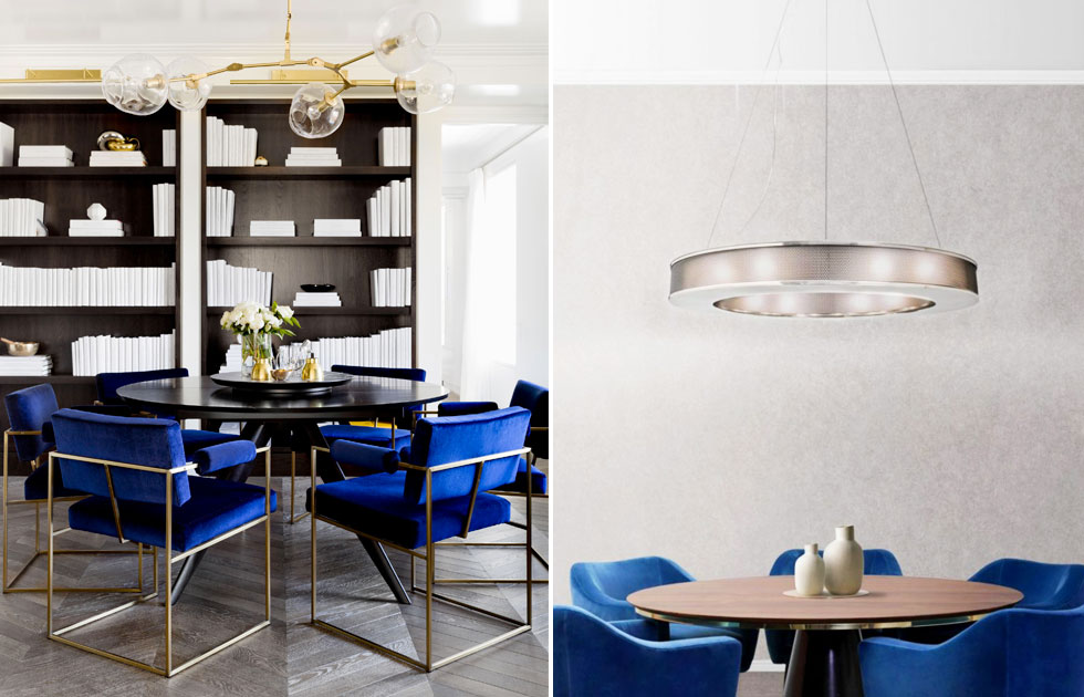
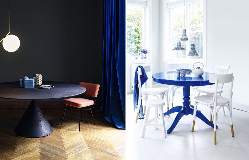
A table, why not?
If we want to add a touch of colour to our home – and in this case I’m talking about the dining room – I’m thinking of a table that make an impact and that could represent the colour fulcrum for the entire house. In this way no one can say that we have used Classic Blue in a trivial way.
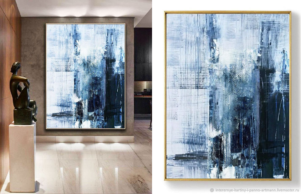
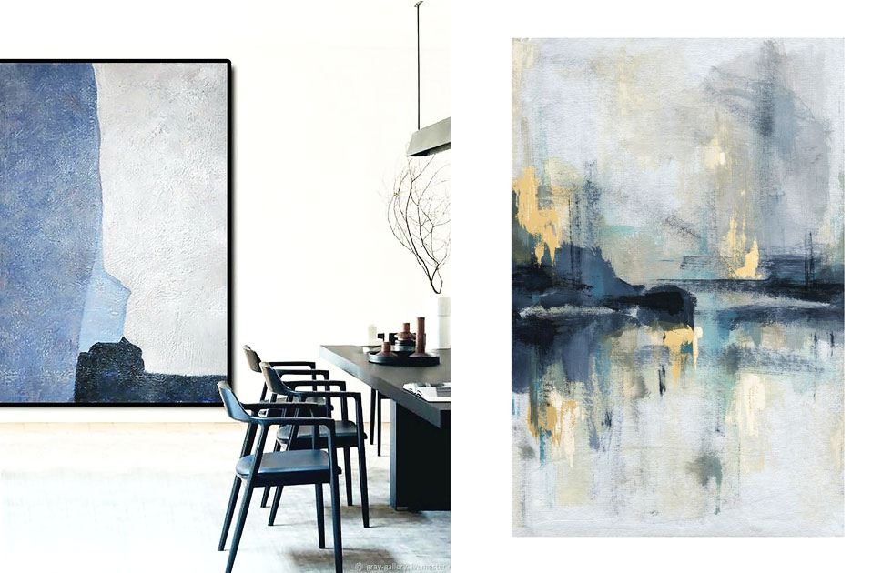
Works of art, of course.
I mentioned this before: the colour of the year is strongly associated with the world of art. So why not focus on paintings, prints and sculptures that give tone to our space?
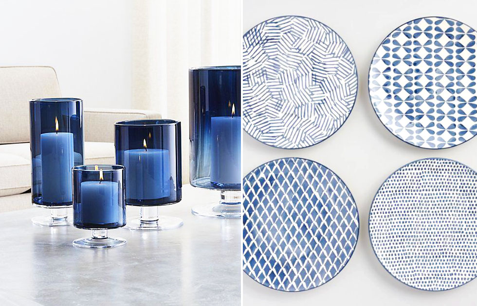
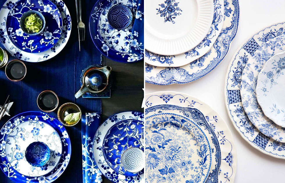
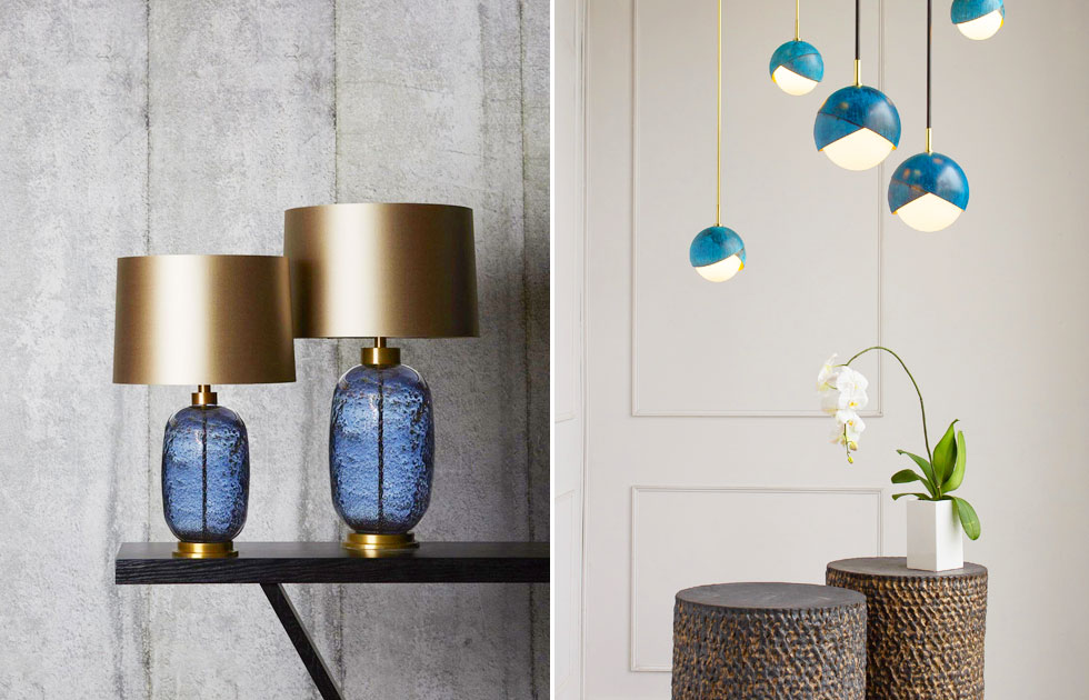
Decoration: Let’s give an open door to imagination.
Obviously, when it comes to decorations we can indulge ourselves. Objects have the advantage of giving us freedom to buy and then change our accessories, even in a short space of time. And so, no advice here. I give you a free hand: let yourself be guided by your instincts when buying the things you like the most in Classic Blue.
But don’t forget when choosing that #beautifulmatters.
And you, what do you think of Pantone’s choice? Do you like Classic Blue? In addition to my advice, do you have any comments or suggestions on how to add colour to furnishings and finishes? Let me know, leave a comment below, or email me at [email protected]