Serena Confalonieri is a young designer born in 1980, who has worked over the years in product design, graphic and design of fabrics, she has become known by several Italian and foreign companies. In 2014 she received a special mention at the Young&Design Awards and in 2016 she won the prestigious German Design Award. Some of her work has been published in well known magazines such as Ottagono, Elle Décor and Interni. Last year she started a partnership with Porro, a historic Brianza-based company, one of the most appreciated at international level, for wood finishing and processing.
I contacted Serena by phone, one Saturday a few weeks ago. The freshness of her work reflects the joviality of her character. After a few minutes of conversation, I asked her to tell me about her first contact with Porro.
She told me, “I was called by Porro early last summer, to help them along the path they had already started in the last Salone del Mobile (2017, ed). A project which focused on the wardrobe, one of their main pieces, a symbolic product for them. For the Salone 2017 the architect and art director Piero Lissoni had already selected the fabrics to cover the wardrobes. Now, Porro wanted to go one step more by after having listened to some suggestions from the R + W studio, its press office. This studio pointed out to me, that as a designer I could be the right person to help in this project that the company was working on. The first idea presented to me was to develop some new fabrics ad hoc. Since this first meeting we then decided to rework graphically, some of their existing furniture products.”
How did you rework the graphics, where did you start?
First of all, I ran a search on their website, the integrated area and downloaded all the images and technical drawings of their products. I started working on their most iconic products, adding others that I liked the most. I focused on those that in my opinion were more harmonious and those with more contemporary lines. Three of the fabrics that I designed were a review of three projects by the Swedish studio Front, because they are more contemporary, with more usable lines.
What techniques did you use for your designs?
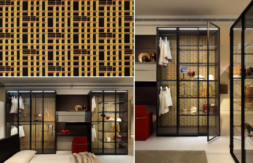
I designed three projects starting from the photographic images, integrating the photos with graphics. For the other two projects, I worked on the technical drawings, editing the axonometric views of the System storage wardrobe and I mixed the technical drawings, perspective plans and axonometric drawings of some of their representative products.
Which three photographic images did you selected?
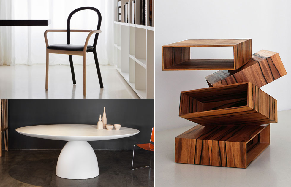
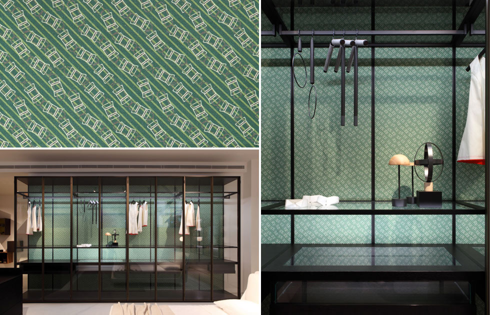
The Gentle chair, the Ellipse table and a piece of furniture called Balancing Boxes.
What prompted you to focus on these inspirational pieces?
I had also designed a floral theme, but making a self-reference to the company seemed to me the most correct way to celebrate their products and to support this project created ‘ad hoc’ by Porro.
In general, how would you describe the style of Porro?
Porro has a very serious, rigorous style. I am very colorful, imaginative, even fresh, so there was a compromise. I proposed many colour palettes and shades for each design. Then they made their selection. Let’s say that we easily found common ground between my work and their style.”
In the beginning, when the press office first suggested I work with them, they were a little unsure. When they started to see that my proposals were not so crazy but in line with their previous production and design, they rightly started to trust me more and left me more freedom to use pastel colors, especially pink and blue. I must say that on both sides there was a fairly natural compromise.
When they told me that my work was under the scrutiny of Piero Lissoni, I immediately thought, “What will happen to the things I’ve created?”. But now I can say I’m very happy to work with them.
Now that all your research and activity has been rewarded by the trust of the company and its art director, if you could look at your work from the outside, what would be your favorite?
Actually, I have more than one.” she smiles on the phone.
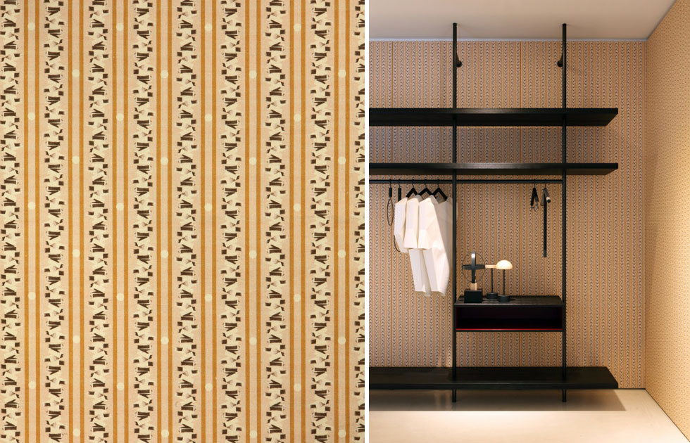
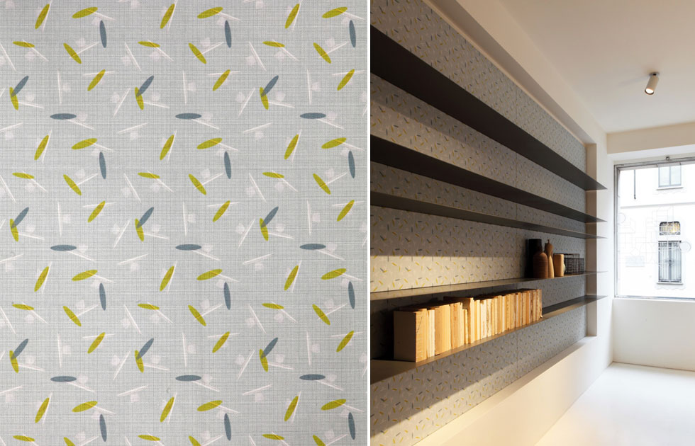
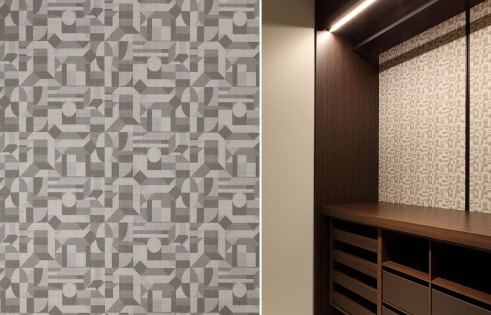
“I really like the one with the Ellipse table motif and the one in grey, originated from a mix of drawings.
Can you tell us an interesting fact about your work experience with Porro?
During their selection process for new fabric, they chose my System Brown fabric design and I was at first a bit stunned: amongst all the cheerful proposals I had made, they chose the more out-of-tone one. But, when I saw it applied to the wardrobe, I had to admit that it was probably the best one. Working with Porro was gratifying because on the one hand they decided to trust me and on the other hand, I had also learned to trust their dynamics of choice. When I eventually saw my graphic system mounted on the wardrobe, I thought “Well spotted!”.