What is a color that personally love? Absolutely without a doubt, it is greige! It is a great source of inspiration for me and I hope from now on, it can be for you too!
Greige was created from a blend of gray and beige, and it is a deeply chic and perfectly balanced, encoded within the color scheme range of Pantone, 16-1109 TCX. Cooler than beige and warmer than gray, greige comes in many shades and matches almost perfectly with other colors, from warm tones to cool tones.
A color that has always been used by Giorgio Armani, who even in 1980 was called, “The King of Greige,” today it has greatly conquered the world of design.
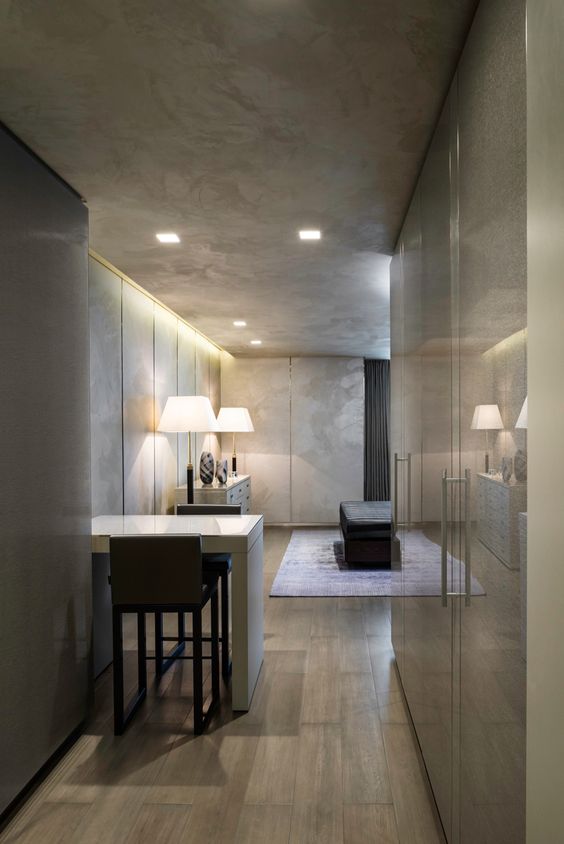
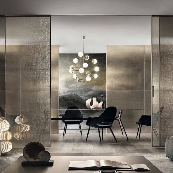
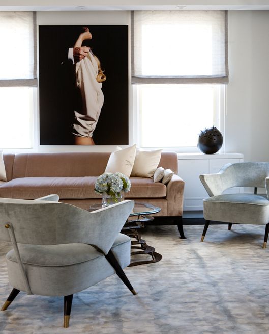
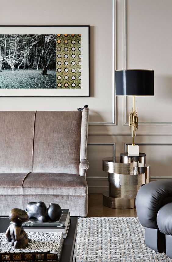
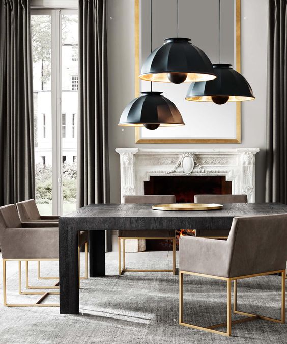
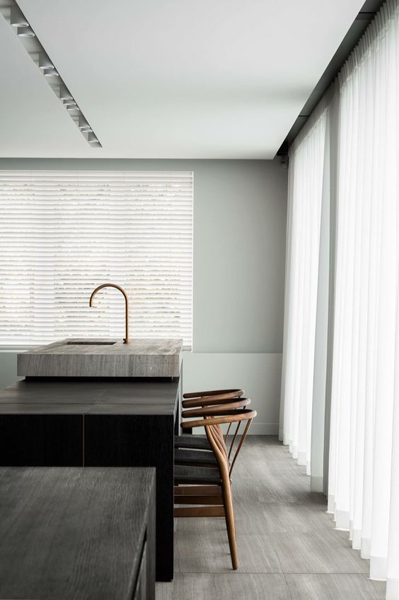
Greige is one of my favorite colors when it comes to interior: it is neutral and natural but at the same time sophisticated. The interiors that use this color immediately acquire a look of refinement, luxury, and pure design.
I like the orderly, balanced, clean and luxurious look that the “greige” environments have. I find this shade perfect when paired with shades of gold and bronze, which can be beautiful if it is matched with essences of wood, stones, and metals.
If you, just like me, are in love with this color too and would like to know what is the perfect greige shade for your home, contact me!
photos source: Pantone, ArchiSnack, Admagazine.ru